Form Validation
jQuery Users
Pages is packaged with jQuery Validation Plugin which is currently the de-facto plugin for form validation.
Please refer to jQuery Validation Plugin Documentation to learn about plugin options
Step one
Include the relevant javascript files inside the
<body>before core template script inclusions, if it's not there already. Please view jQuery plugin inclusion guideline rules
<script type="text/javascript" src="assets/plugins/jquery-validation/js/jquery.validate.min.js">Step two
Create the markup.
<form id="myForm" role="form">
    <div class="row">
        <div class="col-sm-6">
            <div class="form-group form-group-default required">
                <label>First name</label>
                <input type="text" class="form-control" name="firstName" minlength="2" required>
            </div>
        </div>
        <div class="col-sm-6">
            <div class="form-group form-group-default">
                <label>Last name</label>
                <input type="text" class="form-control" name="lastName" minlength="2" required>
            </div>
        </div>
    </div>
    <button class="btn btn-primary" type="submit">Register</button>
</form>
Step three
Apply the plugin.
<script>
$(document).ready(function() {
    $('#myForm').validate();
});
</script>
Error messages
showErrors and errorPlacement functions of jQuery Validate have been overridden in Pages core. As a result, the way error messages are displayed will differ depending on the form layout style you've declared in the code
Standard
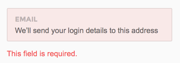
Standard way of showing error messages. Will appear on any form except for forms with attached groups
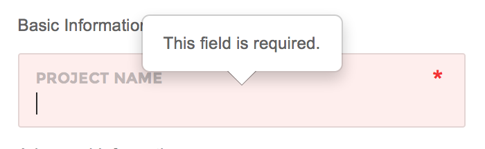
Attached
Recommended to use with Pages default form style having attached elements with .form-group-attached wrapper. The error messages will appear in the form of popovers.
AngularJS Users
Form validation is available in AngularJS without use of any additional plugin.
Standard/Default forms
<form name="personal" id="form-personal" role="form" novalidate>
    <div class="row">
        <div class="col-sm-12">
            <div pg-form-group class="form-group form-group-default input-group" ng-class="{ 'has-error' : personal.username.$invalid && !personal.username.$pristine }">
                <label>Username</label>
                <input type="text" class="form-control" name="username" placeholder="Username" ng-model="user.username" required>
            </div>
            <label class="error" for="username" ng-show="personal.username.$invalid && !personal.username.$pristine">This field is required.</label>
        </div>
    </div>
    <div class="row">
        <div class="col-sm-12">
            <div pg-form-group class="form-group form-group-default" ng-class="{ 'has-error' : personal.password.$invalid && !personal.password.$pristine }">
                <label>Password</label>
                <input type="password" class="form-control" name="password" placeholder="Minimum of 4 characters." ng-model="user.password" required>
            </div>
            <label class="error" for="password" ng-show="personal.password.$invalid && !personal.password.$pristine">This field is required.</label>
            <label class="error" for="password" ng-show="personal.password.$error.minlength">Password should have at least 4 characters</label>
        </div>
    </div>
    <div class="row">
        <div class="col-sm-12">
            <div pg-form-group class="form-group form-group-default" ng-class="{ 'has-error' : personal.email.$invalid && !personal.email.$pristine }">
                <label>Email</label>
                <input type="email" class="form-control" name="email" ng-model="user.email" required>
            </div>
            <label class="error" for="email" ng-show="personal.email.$invalid && !personal.email.$pristine">Enter a valid email.</label>
        </div>
    </div>
    <div class="clearfix"></div>
    <button class="btn btn-primary" type="submit" ng-disabled="personal.$invalid">Submit</button>
</form>
Attached forms
Pages recommended way of showing errors for attached forms is via Bootstrap's popover plugin. The following example shows how to do it via a custom directive.
angular.module('app')
    .directive('validateAttachedFormElement', function() {
        return {
            restrict: 'A',
            require: '?ngModel',
            link: function(scope, elm, attr, ctrl) {
                if (!ctrl) {
                    return;
                }

                elm.on('blur', function() {
                    if (ctrl.$invalid && !ctrl.$pristine) {
                        $(elm).popover('show');
                    } else {
                        $(elm).popover('hide');
                    }
                });

                elm.closest('form').on('submit', function() {
                    if (ctrl.$invalid && !ctrl.$pristine) {
                        $(elm).popover('show');
                    } else {
                        $(elm).popover('hide');
                    }
                });

            }
        };
    });
<form id="form-project" role="form" autocomplete="off" name="project" novalidate>
<div class="form-group-attached">
<div pg-form-group class="form-group form-group-default required" ng-class="{ 'has-error' : project.projectName.$invalid && !project.projectName.$pristine }">
<label>Project name</label>
<input type="text" class="form-control" name="projectName" ng-model="project_.projectName" ui-jq="popover" data-container="body" data-placement="top" data-content="This field is required" data-trigger="manual" validate-attached-form-element required>
</div>
</div>
<button class="btn btn-success" type="submit" ng-disabled="project.$invalid">Submit</button>
</form>