Introducing pages adaptive color system.
Color is a core building block of any design system. Pages color system help create scalable color themes, ensures accessible text, and distinguishes UI elements and surfaces from one another.
Have an Improvement or a suggestion?
goto request box
Pages color spectrum
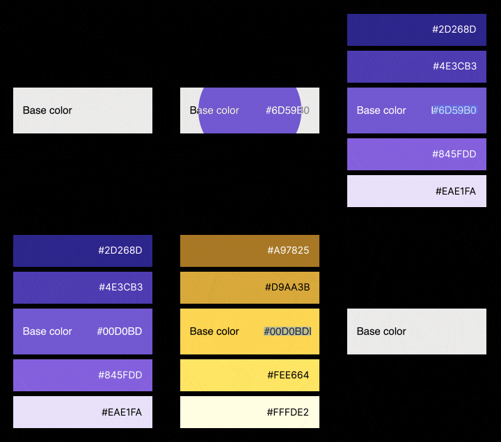
Color should be used consistently in any product so that certain colors always mean the same thing. For example, Pages red is used to show alerts and warnings. The Pages color spectrum ensures all possible context for use of color is covered with each base color having its shades and tints generated automatically.

Pages color swatches
Download pages dashboard compleate spectrum color palette for photoshop
Primary color - Pages purple
color-primary
Complete color - Pages blue
color-complete
Success color - Pages green
color-success
Warning color - Pages yellow
color-warning
Danger color - Pages red
color-danger
Info color - Pages gray
color-info
Neutral color spectrum
The neutral color palette is made with two contrasting colors on either side, usually white and black. The rest of the colors in the middle are auto-generated to be used for various UI elements and surfaces, for example, color-contrast-lower is used for background and color-contrast-high is used for regular paragraphs.
color-contrast-lowest
Background
color-contrast-lower
Background light
color-contrast-low
Borderds
color-contrast-medium
Muted/helper text
color-contrast-high
Regular paragraphs
color-contrast-higher
Headings
Legibility standards
We believe any user of diverse abilities should be able to navigate and understand and use UI, especially when the content a user is dealing with is sensitive and important. Making every text accessible from almost 17 million colors in the hexadecimal scale is a big challenge for anyone.
Pages color system automatically picks the best legible text color for a given background maintaining a AA contrast ration according to Web Content Accessibility Guidelines or WCAG.

Color calibration
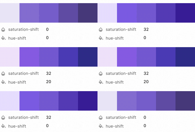
Pages color system is equipped with a set of modifiers to give you the total control and freedom on how colors should apply and adapt accordingly. Color calibration helps to give flat shades and tints more vibrance while making sure we perceive the difference between the colors from shades to tints.
Hue shift takes a color's relative luminance into consideration in order to determine the direction of the hue rotation.
Pages purple - color-primary shades

Global color variables
$mix-percentage-lighter
20%
$mix-percentage-lighter
90%
$mix-percentage-dark
60%
$mix-percentage-darker
30%
$saturation-shift
14%
$hue-shift
8%