Custom built for anyone, anywhere.
As always, in keeping with our policy of making UX easier and more user-friendly, we have customized this feature with a lightweight SVG indicator. Also this is highly adaptable and offers a range of progress bar options to suit your preference.
VIA senior product manage
for UI/UX at REVOX

A progress bar is a visual way of showing how much of a curtain task has been completed. We made it light weighted and simple as possible just for better user experience. Progress can be indeterminate or determinate according to the length of a task.
Indeterminate progress
Determinate progress

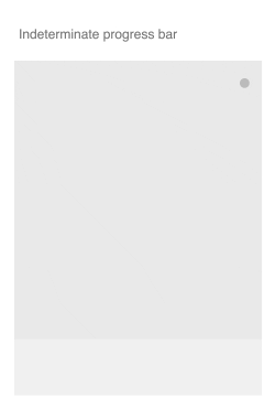
Indeterminate progress bar
This progress is used when the length of the task is unknown. Thus shows a repetitive cycle. With the use of a scalable vector graphic we made it light weighted and simple for a better UX.
Determinate progress bar
This progress is used when the length of the task can be measured and visually shown. Thus for linear progress determinate is used frequently. To use simply use .progress-bar-determinate
Colour options
You can also apply any color suited according to the nature of the task.
All the colors included in pages color palette are applicable.
Bar sizes
You can also use a thinner version of the default progress by simple changing .progress-small
Circular progress is frequently used to show a repetitive cycle for its shape. But breaking convention a circular progress can be indeterminate or determinate according to a task. Developed mainly for better Visual Experience.
Indeterminate Progress
Determinate Progress

Indeterminate progress
This is mostly used for its repetitive circular shape for tasks in which the time cannot be measured. With the use of SVG, the size can be scaled to any preferred amount by the user without any quality loss. We developed a custom animation with different timescales and animation curves for natural look and feel.
Determinate progress
Similar to the determinate progress bar, circular progress can also be used to show the length of a task. The determinate circular progress indicator can be initialized without writing a single line of Javascript code.
Color options
Complete Progress bar color
Set data attribute data-color to "complete"
Complete Progress bar color
Set data attribute data-color to "primary"
All the colors included in pages color palette is applicable
Circular progress sizes
In circular progress, you can change the stroke width
Default progress with a stroke of 3px
Progress with a stroke of 3px