A button consists of text and/or an image that clearly communicates what action will occur when it is pressed upon.
VIA senior product manage
for UI/UX at REVOX
Color can be a wonderful tool for making your dashboard less stressful and more calming
Color can be a wonderful tool for making your dashboard less stressful and more calming — and it can have a significant impact on your mood and well-being, We made it with you in mind
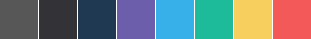
Primary Button
Normal
#6d5eac
Hover
20% white
Active
16.5% white
pages Default Multi-Purpose Theme Color. Add class by simply typing
btn-primary
Complete Button
Normal
#6d5eac
Hover
20% white
Active
16.5% white
pages Default Multi-Purpose Theme Color. Add class by simply typing
btn-complete
Success Button
Normal
#6d5eac
Hover
20% white
Active
16.5% white
pages Default Multi-Purpose Theme Color. Add class by simply typing
btn-success
Danger Button
Normal
#6d5eac
Hover
20% white
Active
16.5% white
pages Default Multi-Purpose Theme Color. Add class by simply typing
btn-danger
Warning Button
Normal
#6d5eac
Hover
20% white
Active
16.5% white
pages Default Multi-Purpose Theme Color. Add class by simply typing
btn-warning
White Button
Normal
#6d5eac
Hover
20% white
Active
16.5% white
pages Default Multi-Purpose Theme Color. Add class by simply typing
btn-danger
Fancy larger or smaller buttons?
We made it all Perfect.
Size Might vary from smaller screen to a larger screen. We made few sizes that are pixel perfect and resposive
Size variation
Fancy larger or smaller buttons? Add .btn-lg .btn-sm .btn-xs for additional sizes.
Button groups can act as a radio or a switch or even a single toggle. Below are some examples click to see what happens
A button can animate to show hidden content
The button will be automatically sized according to the visible content size. Make sure there is enough room for the hidden content to show
btn-animated and diirection as from-left or from-top
Create block level buttons,those that span the full width of a parent by adding btn-block
We've simplified our dropdown buttons by getting rid of the dedicated dropdown associated with them, this looks more clean and also available in all different colors
The button will be automatically sized according to the visible content size. Make sure there is enough room for the hidden content to show
Create block level buttons,those that span the full width of a parent by adding .btn-block
The button will be automatically sized according to the visible content size. Make sure there is enough room for the hidden content to show
A button can be circular:
Circular buttons are a special type of promoted action. It Distinguish a different action or a style.
Like buttons you can also use different sizes to button groups
Go wild! mix it and make it intererting, add different groups with dropdowns
Want it in a different perspective? its customized to work both vertical and horizontal ways
Want it in a different perspective? its customized to work both vertical and horizontal ways
Basic buttons are traditional buttons with borders and background with an extra component like an icon. You can place it either on the left or the right which ever you want with different color options
Fancy social icons? here are some of pre-made icons and buttons done by use which can come in handy


