Pages Frontend Documentation
Beautifully Hand Crafted, Light Weight, Hardware Accelerated UI Framework
Introduction
Pages is now aviable for both admin dashboards as well as Frontend, you will be able to experience the same great features that you had in Pages dashboard also Pages frontend as well.
This documentation guide for all Pages users who can even be a beginner to Web development
Light Weight & Ready to Go
The entire set of modules clocks in at 38KB* minified and gzipped. Crafted with mobile devices in mind, it was important to us to keep our file sizes small, and every line of CSS was carefully considered. If you decide to only use a subset of these modules, you'll save even more bytes.
Production level usage using minfied and gzipped files
|
CSS
38Kb
|
JS
1.8Kb
|
Icons
12Kb
|
Other
120Kb
|
Getting Started
This part of the doc will help you to quick start your project and will you a basic idea about how Pages Frontend works.
What's Included
Once you have download the package you will see the following folder structure in "frontend" Folder
Whats Inside getting_started
This folder is a quickstart template to help you start your website, you can copy content blocks from samples folder to your to this and create you custom version
Folder : assets
This folder is entirely dedicated for you and you can add your own images, custom css and js files, its grouped into resource folders for best practice
Folder : pages
This where the magic happens and contains pre-complied version of Pages, we do recommend updating any contents of the folder as all future updates are affected directly to this
Whats Inside demo
This folder contains all the alternative websites that we have created using Pages frontend.
You can copy elements/blocks from one sample 01 to sample 02 they will work entirely on all the pages
Whats Inside grunt and gulp
Pages support two popular build systems called Grunt and Gulp.
Other Useful resources that you may find:
Working with Less
Less is a CSS pre-processor, meaning that it extends the CSS language, adding features that allow variables, mixins, functions. Pages supports Less and is pure built on top of Less
Less Files are found under pages/less
Modules
The seperation of modules help you to remove whats not necessary and build your own custom pages css You an import any modules from pages dashboard less to pages frontend less.
| Name | Description |
|---|---|
| layout.less | The core layout styles for pages frontend |
| respnsive.less | The responsive handlers |
| panels.less | Bootstrap Panels over-written classes |
| typography.less | Contains all typo related styles included bg-color |
| swiper.less | Image slider classes |
| button.less | Bootstrap button over-written classes and pages dropdown |
| alerts.less | Bootstrap alert messages over-written classes |
| progress_indicators.less | Pages progress bars, bootstrap native progress |
| modals.less | Bootstrap Modal Classes |
| tabs_accordian.less | Bootstrap tabs and accordains |
| form_elements.less | All form related class including layouts & validations |
| tables.less | Classes for bootstrap tables and datatables |
| tables.less | Classes for bootstrap tables and datatables |
| misc.less | All other utilities and helper classes |
| z-index.less | To maintian heierachchy and order for layers |
| demo.less | Demo purpose classes for setting heights |
Varriables
Varriables help to generate themes, you can custom build you very own theme. The varriables will be include inside a specific theme
e.g:
less/themes/default/var.less by changing the a few 5 main color varrables you can create your own color palette
Creating your own Color Pallete
By simply changing the following varriables the entire color palete mention here will change
Color Palette
Main Base color
@color-master
Primary Colors
@color-success
@color-complete
@color-primary
@color-warning
@color-danger
@color-info
Mixins
We have made a wide varraity of mixins that can be used in less,
mixins can be found under pages/src/less/mixin.less
Compiling
We recommend to compile locally without using less.js library, there are many Less compilers for Windows, Mac and also Linux users but we made it even easier. With pages powerful CLI you can compile it without any thirdparty software, simple do any changes to the less files in pages/less and it automatically updates the css in pages/css/pages-frontend.css
Use the following commmands on your terminal
Using Grunt
This command will automatically compile the less to css on file save
$ grunt watchThis command will compile the less to css on execute
$ grunt lessRead more about how to setup Grunt
Using Gulp
This command will automatically compile the less to css on file save
$ gulp watchThis command will compile the less to css on execute
$ gulp lessWorking with Grunt
In one word: automation. The less work you have to do when performing repetitive tasks like minification, compilation, unit testing, linting, etc, the easier your job becomes. After you've configured it through a Gruntfile. Pages supports Grunt to make it even easier for developers, this allows us to implement a powerful command line interface for pages. Here are some of the things that we have added using grunt
Installing Grunt
To install grunt first you must have NodeJs installed, NodeJS will have npm (node packaged modules)
Run the following commands
- Install
grunt-cliglobally by running the following commandnpm install -g grunt-cli - In you downloaded package from themeforest, navigate to
grunt/directory and copy bothpackage.jsongruntfile.jsto your project root. e.g :getting_startedfolder - Navigate to the root directory of your project, then run
npm install.
Once you have succesfully setup now you can use pages Grunt CLI commands to automate your task
Commands
Grunt Build
This will automatically minify your assets resources like css and js into a folder called dist
Grunt Watch
This will automaically compile the pages Less files on save
Grunt Less
This will compile the pages Less files on excute once
Your are free to customize the Grunt task to your need by editing the gruntfile.js in the root directory of getting_started
Troubleshooting
Should you encounter problems with installing dependencies or running Grunt commands, first delete the /node_modules/ directory generated by npm. Then, rerun npm install.
Working with Gulp
Gulp is another famous build system supported by pages, gulp's use of streams and code-over-configuration makes for a simpler and more intuitive build.
Installing Gulp
To install gulp first you must have NodeJs installed, NodeJS will have npm (node packaged modules)
Run the following commands
- Install
gulpglobally by running the following commandnpm install -g gulp - In you downloaded package from themeforest, navigate to
gulp/directory and copy bothpackage.jsongulpfile.jsto your project root. e.g :getting_startedfolder - Navigate to the root directory of your project or getting_started folder, then run
npm install.
Once you have succesfully setup now you can use pages Gulp CLI commands to automate your task
Commands
gulp build
This will automatically minify your assets resources like css and js into a folder called dist
gulp watch
This will automaically compile the pages Less files on save
gulp less
This will compile the pages Less files on excute once
Your are free to customize the Gulp task to your need by editing the gulpfile.js
Troubleshooting
Should you encounter problems with installing dependencies or running Gulps commands, first delete the /node_modules/ directory generated by npm. Then, rerun npm install.
Browser Support
Pages is built keeping mind to support a wide range of browsers and devices. We all major browers Google Chrome, Mozilla Firefox, Safari, Opera, Internet Explorer 9 and Above
Pages not only is supported by major browser but also is hardware accelarated using the GPU
| Chrome | Firefox | Internet Explorer | Opera | Safari | |
|---|---|---|---|---|---|
| Android | Supported | Supported | N/A | Not Supported | N/A |
| iOS | Supported | N/A | Not Supported | Supported | |
| Mac OS X | Supported | Supported | Supported | Supported | |
| Windows | Supported | Supported | Supported | Supported | Not Supported |
API Reference
As mentioned in the Getting Started guide, Pages core framework files can be found in the pages folder. Inside this you'll be able to find pages.js and pages.min.js files which contain the core logic and utility functions of the framework. Simply including either of these files will set environment variables, auto initialize all the core modules for you and present you with the Pages global object
$.Pages which you can use to call utility functions.
<!-- Initialize Pages core objects -->
<script type="text/javascript" src="pages/js/pages.min.js">
Environment variables
Pages will detect the user OS and add it as a class name (ex: 'windows', 'mac', 'unix', 'linux') into body.
It will also detect if it's mobile device or desktop and add either 'mobile' and 'desktop' into the same tag.
Auto-initialized jQuery Plugins
The following table shows which plugins are auto-initialized and their default configuration.
| Plugin | jQuery | AngularJS |
|---|---|---|
| Unveil | Applied to any img
|
|
Utility functions
$.Pages.init()
Reinitialize Pages core
$.Pages.isVisibleXs()
Returns true if the current viewport is an extra small device. ex: Phones (<768px)
$.Pages.isVisibleSm()
Returns true if the current viewport is a small device. ex: Tablets (≥768px)
$.Pages.isVisibleMd()
Returns true if the current viewport is a medium device. ex: Desktops (≥992px)
$.Pages.isVisibleLg()
Returns true if the current viewport is a large device. ex: Desktops (≥1200px)
$.Pages.getUserAgent()
Reads the pre-set user-agent class from body and returns either 'mobile' or 'desktop'
$.Pages.setFullScreen(element)
Makes the given element to go full-screen mode. ex: $.Pages.setFullScreen(document.querySelector('html'));
$.Pages.getColor(color,opacity)
Returns the rgba value for a given Pages contextual color and opacity.
Grid
Bootstrap grid includes a responsive, mobile first fluid grid system that appropriately scales up to 12 columns as the device or viewport size increases. It includes predefined classes for easy layout options, as well as powerful mixins for generating more semantic layouts
Introduction
Grid systems are used for creating page layouts through a series of rows and columns that house your content. Here's how the Bootstrap grid system works:
- You must start with
row - There are pre-define classes of columns starting from 1 to 12, example
col-md-1tocol-md-12 - Each of these value represent a percentage of the screen, 1 being the smallest and 12 being 100%
- You can create different grid pattern that finally forms 12
example :
<div class="row">
  <div class="col-md-1">.col-md-1</div>
  <div class="col-md-1">.col-md-1</div>
  <div class="col-md-1">.col-md-1</div>
  <div class="col-md-1">.col-md-1</div>
  <div class="col-md-1">.col-md-1</div>
  <div class="col-md-1">.col-md-1</div>
  <div class="col-md-1">.col-md-1</div>
  <div class="col-md-1">.col-md-1</div>
  <div class="col-md-1">.col-md-1</div>
  <div class="col-md-1">.col-md-1</div>
  <div class="col-md-1">.col-md-1</div>
  <div class="col-md-1">.col-md-1</div>
</div>
<div class="row">
  <div class="col-md-8">.col-md-8</div>
  <div class="col-md-4">.col-md-4</div>
</div>
<div class="row">
  <div class="col-md-4">.col-md-4</div>
  <div class="col-md-4">.col-md-4</div>
  <div class="col-md-4">.col-md-4</div>
</div>
<div class="row">
  <div class="col-md-6">.col-md-6</div>
  <div class="col-md-6">.col-md-6</div>
</div>| Extra small devices Phones (<768px) | Small devices Tablets (≥768px) | Medium devices Desktops (≥992px) | Large devices Desktops (≥1200px) | |
|---|---|---|---|---|
| Grid behavior | Horizontal at all times | Collapsed to start, horizontal above breakpoints | ||
| Container width | None (auto) | 750px | 970px | 1170px |
| Class prefix | .col-xs- |
.col-sm- |
.col-md- |
.col-lg- |
| # of columns | 12 | |||
| Column width | Auto | ~62px | ~81px | ~97px |
| Gutter width | 30px (15px on each side of a column) | |||
| Nestable | Yes | |||
| Offsets | Yes | |||
| Column ordering | Yes | |||
Helpers
Pages helper css classes allow you to build your custom layout without touching any CSS code
These classes are generic helper classes predifined in the CSS of pages, here is quick view what they can do
- Set margins - Available for all directions from 5 - 90 px stepping value 5px
- Set padding - Available for all directions from 5 - 90 px stepping value 5px
- Set border - Available for all sides, default pages border color
- Border Radius - Option to set border radius, size sm / md / lg
- Image wrapping - Circular image wrap with custom size, sm / md / lg
Margins
You can add this helper class to any element in your HTML code to set Margins
| First Prefix ( m-*) | Second Prefix(m-t/b/l/r-*) | Last Prefix(m-t-$value) |
|---|---|---|
| m for margin | t : top, b : bottom, l : left, r : right | 5,10,15,20, ... 90 |
example :
m-t-10 which means Margin Top 10px
m-b-20 which means Margin Bottom 20px
m-l-5 which means Margin Left 5px
m-r-35 which means Margin Right 35px
Rule :
Value can not be anything, 1,2,4,5,6. It has a step of 5px, eg: 5,10,15
Other options :
To remove margin from a HTML element add the class no-margin
Padding
You can add this helper class to any element in your HTML code to set Padding
| First Prefix ( p-*) | Second Prefix(p-t/b/l/r-*) | Last Prefix(p-t-$value) |
|---|---|---|
| p for padding | t : top, b : bottom, l : left, r : right | 5,10,15,20, ... 90 |
example :
p-t-10 which means Padding Top 10px
p-b-20 which means Padding Bottom 20px
p-l-5 which means Padding Left 5px
p-r-35 which means Padding Right 35px
Rule :
Value can not be anything, 1,2,4,5,6. It has a step of 5px, eg: 5,10,15
Other options :
To remove padding from a HTML element add the class no-padding
Border
You can add this helper class to any element in your HTML code to set Border, border currently supports one pixel
| First Prefix ( b-*) | Second Prefix(b-t/b/l/r/a-*) |
|---|---|
| b for border | t : top, b : bottom, l : left, r : right, a : all |
Border Color
By default pages is shipped with border helper classes are of two
b-transparent 40% opacity
b-grey
b-primary
b-success
b-complete
b-danger
b-warning
example :
<div class="b-b b-grey">
  I have a bottom border
</div>
Border Style
b-dashed - change the border style to 'dashed'
b-thick - change the border width to 2px
Border Radius
Helpy class to apply quick border radius, you can change the value in misc.less or in style.css
| Class | Description |
|---|---|
b-rad-sm |
3px border radius |
b-rad-md |
5px border radius |
b-rad-lg |
7px border radius |
Table-like behavior
Add table behavior to any div by using these helper classes. These classes will come handy when you want to vertically align any content like in native tables.
example :
<div class="container-sm-height bg-master-lighter" style="height:200px">
    <div style="height:50px" class="row row-sm-height b-b b-grey">
        <div class="col-sm-12 col-sm-height col-top ">
            <span class="hint-text">I'm top aligned just like in a table-cell</span>
        </div>
    </div>

    <div class="row row-sm-height ">
        <div class="col-sm-12 col-sm-height col-middle ">
            <span class="hint-text">I'm middle aligned just like in a table-cell</span>
        </div>
    </div>
</div>
The table created in the above example is only activated for resolutions ≥768px. Hence the prefix *-sm-*. You can replace *-sm-* with any other breakpoint prefix defined in Bootstrap to restrict the table-like behavior to a particular resolution (ex: 'xs','md','lg')
You can also append col-middle, col-top or col-bottom to col-*-height to vertically align the content
It is also possible to mix these classes together with Bootstrap's row and col-*-* classes without any conflict
Elements that resize maintaining aspect ratio
Make the height of any element auto-adjust depending on its width while constraining to a given aspect ratio.
example :
1x2
2x3
1x1
3x2
2x1
<div class="row">
    <div class="col-sm-3">
        <div class="ar-1-2">
            <div class="bg-master-light padding-20">
                <h3>1x2</h3>
            </div>
        </div>
    </div>

    <div class="col-sm-3">
        <div class="ar-2-3">
            <div class="bg-master-light padding-20">
                <h3>2x3</h3>
            </div>
        </div>
    </div>

    <div class="col-sm-3">
        <div class="ar-1-1">
            <div class="bg-master-light padding-20">
                <h3>1x1</h3>
            </div>
        </div>
    </div>

    <div class="col-sm-3">
        <div class="ar-3-2">
            <div class="bg-master-light padding-20">
                <h3>3x2</h3>
            </div>
        </div>
    </div>

    <div class="col-sm-3 m-t-20">
        <div class="ar-2-1">
            <div class="bg-master-light padding-20">
                <h3>2x1</h3>
            </div>
        </div>
    </div>
</div>
Absolute positioning
Makes elements to have position:absolute. Add .relative to the parent of the element that you want to be absolute to have relative positioning
example :
<div class="relative" style="height:300px">
    <!-- Equivalent to "pull-up" -->
    <div class="top-left bg-master-light text-center padding-20">Top-left</div>
    <!-- Equivalent to "pull-bottom" -->
    <div class="bottom-left bg-master-light text-center padding-20">Bottom-left</div>
    <div class="top-right bg-master-light text-center padding-20">Top-right</div>
    <div class="bottom-right bg-master-light text-center padding-20">Bottom-right</div>
</div>
It is also possible to mix two or more classes. ex: Mixing top-left top-right will produce the following CSS styling
top:0; left:0; right:0
Misc. classes
| Class name | Description |
|---|---|
full-width |
Spans the element to have 100% width of the parent |
full-height |
Spans the element to have 100% height of the parent |
scrollable |
Adds overflow-y:auto |
center-margin |
Adds margin-left:auto; margin-right:auto. Useful when center aligning any div |
inherit-size |
Inherits width and height from parent |
inherit-height |
Inherits only the height from parent |
hide |
Hides any element |
inline |
Adds display:inline-block |
Headers
This part of the document will help you understand the types of headers, there color options and size options available
Sizes Classes
bg-header
Larger header with 110px height, you can change height in var.less varriable name : @header-big-height
md-header
Medium header with 88px height, you can change height in var.less varriable name : @header-medium-height
sm-header
Small header with 44px height, you can change height in var.less varriable name : @header-small-height
minimized
Small header with 60px height, you can change height in var.less varriable name : @header-minimized-height
Color Classes
transparent-light
Transparent header with no background and white text
transparent-dark
Transparent header with no background and black/dark text
dark
Dark/Black header with white text
white
White header with black text
Other Options
data-pages="header"
Add the following attribute to initialize Pages header and monitor your header : Required
data-pages-header="autoresize"
Helps to initialize auto resize
data-pages-resize-class="light"
You can decide what class you want to add when the header resizes, you can make add the color classes to change from transparent to light
HTML Structure
<!-- BEGIN HEADER -->
    <nav class="header bg-header transparent-dark " data-pages="header" data-pages-header="autoresize" data-pages-resize-class="dark">
      <div class="container relative">
        <!-- BEGIN LEFT CONTENT -->
        <div class="pull-left">
          <!-- .header-inner Allows to horizontally Align elements to the Center-->
          <div class="header-inner">
            <!-- BEGIN LOGO -->

          </div>
        </div>
        <!-- END HEADER TOGGLE FOR MOBILE & TABLET -->
        <!-- BEGIN RIGHT CONTENT -->
        <div class="menu-content mobile-dark pull-right clearfix" data-pages-direction="slideRight" id="header">
          <!-- YOUR MENU ITEMS -->

          <!-- END MENU ITEMS -->
        </div>
      </div>
    </nav>
You can use pull-left pull-center pull-right to align content you want, make sure you add the div
header-inner so that you content automatically align horizontaly without the need of top and bottom paddings
Menu Items
Have all your menu items inside the following as show :
<!-- BEGIN RIGHT CONTENT -->
<div class="menu-content mobile-dark pull-right clearfix" data-pages-direction="slideRight" id="header">
<!-- BEGIN HEADER CLOSE TOGGLE FOR MOBILE -->
<div class="pull-right">
<a href="#" class="padding-10 visible-xs-inline visible-sm-inline pull-right m-t-10 m-b-10 m-r-10" data-pages="header-toggle" data-pages-element="#header">
<i class=" pg-close_line"></i>
</a>
</div>
<!-- END HEADER CLOSE TOGGLE FOR MOBILE -->
<!-- BEGIN MENU ITEMS -->
<div class="header-inner">
<ul class="menu">
<li>
<a href="#" class="active">Home </a>
</li>
<li>
<a href="#">Elements </a>
</li>
<li>
<a href="pricing.html" >Pricing </a>
</li>
<li>
<a href="portfolio.html" >Portfolio </a>
</li>
<li>
<a href="contact.html">Contact Us</a>
</li>
</ul>
<a href="#" class="search-toggle hidden-xs hidden-sm"><i class="fs-14 pg-search"></i></a>
<!-- BEGIN COPYRIGHT FOR MOBILE -->
<div class="font-arial m-l-35 m-r-35 m-b-20 bottom-left visible-sm visible-xs">
<p class="fs-11 no-margin small-text p-b-20">Exclusive only at ,Themeforest.
See Standard licenses & Extended licenses
</p>
<p class="fs-11 small-text muted">Copyright © 2014 REVOX</p>
</div>
<!-- END COPYRIGHT FOR MOBILE -->
</div>
<!-- END MENU ITEMS -->
</div>Rules :
- Have the menu-content inside a nav.header
- Have an ID to your menu-content
Mobile Menu
Now you have the flexibilty to choose how your menu will look like on mobile, all these are added to "menu-content" DIV, this is how it looks like
<div class="menu-content mobile-dark pull-right clearfix" data-pages-direction="slideRight" id="header">

</div>
Animation Options
Change the following attribute value
data-pages-direction
You can change to it to
slideLeft
slideRight
overlay
Color Options
By default you will see a white menu on mobile, you can change it to dark/black by addding the class "mobile-dark" to you "menu-content" div
Toggle On/Off Menu : Mobile
Add the following attributes with the ID you have used in your "menu-content", this means you can have more than one menu-content
<a href="#" data-pages="header-toggle" data-pages-element="#header">
  <i class=" pg-close_line"></i>
</a>
Callback
Once the menu is opened, a class menu-open is added to the body
Slider
Slider is powered by a Custom Swiper plugin made only for Pages Frontend. We have added some cool new features and credit goes to the author @Vladimir Kharlampidi
HTML Structure
<!-- Slider main container -->
<div class="swiper-container">
    <!-- Additional required wrapper -->
    <div class="swiper-wrapper">
        <!-- Slides -->
        <div class="swiper-slide">Slide 1</div>
        <div class="swiper-slide">Slide 2</div>
        <div class="swiper-slide">Slide 3</div>
        ...
    </div>
    <!-- If we need pagination -->
    <div class="swiper-pagination"></div>

    <!-- If we need navigation buttons -->
    <div class="swiper-button-prev"></div>
    <div class="swiper-button-next"></div>

    <!-- If we need scrollbar -->
    <div class="swiper-scrollbar"></div>
</div>
Parrallax Slides HTML Structure
<div class="swiper-container">
<div class="swiper-wrapper">
  <!-- BEGIN SLIDE -->
  <div class="swiper-slide fit">
    <!-- BEGIN IMAGE PARRALAX -->
    <div class="slider-wrapper">
      <div class="image" data-swiper-parallax="30%">
        <img draggable="false" src="assets/images/hero_1.jpg" class="image-responsive-height" alt="" title="">
      </div>
    </div>
    <!-- END IMAGE PARRALAX -->
    <!-- BEGIN CONTENT -->
    <div class="content-layer">

    </div>
    <!-- END CONTENT -->
  </div>
  <!-- END SLIDE -->
 </div>
</div>
Javascript
Initialize your plugin
//Intialize Slider
var slider = new Swiper('#my-hero-element-id', {
    pagination: '.swiper-pagination',
    paginationClickable: true,
    nextButton: '.swiper-button-next',
    prevButton: '.swiper-button-prev',
    slidesPerView: 1,
    loop: true,
    parallax: true,
    speed:1000,
});
Arrow Elements
Arrow navigations options and classes
<div class="swiper-button-prev"></div>
<div class="swiper-button-next"></div>
Color Classes
swiper-navigation swiper-white-solid
Add the class to your swiper navigation for squre white arrow
swiper-navigation swiper-dark-solid
Add the class to your swiper navigation for squre white arrow
swiper-rounded
Add the class to your swiper navigation with the above classes mention previous to have a rounded navigation
Responsive Elements
Simply add the class fit to your slide and it will scale all your headings and parragraphs
To scale images add the class image-responsive-height or image-responsive-width as required
Aniimating Slider Elements
All elements are animate using VelocityJS and VelocityJS.UI(optional), You can even right pure JS code to animate using velocityJS but we have made it easy using Pages data-atttributes.
Custom Animation
Being able to animate an element by its css attritbute, e.g: top, scale ...
<h1
data-pages-animation="custom"
data-attr="scale"
data-delay="600"
data-duration="500"
data-end="4"
data-start="0"
data-easing="easeInSine"
>
Hello World!
</h1>| Attribute | Value | Description |
|---|---|---|
| data-pages-animation | custom | | To determin the type of animation |
| data-attr | Any CSS attribute | The attribute you want to animate eg : top, left, padding-left, translateX... |
| data-delay | Miliseconds : eg: 400 | The time you want to delay the animation as soon as the slide appears. Default 400 |
| data-duration | Miliseconds : eg: 500 | How long you wish to keep the animation going |
| data-start | Start position | This depends on the attribute you selected. Its can be px,em, % etc |
| data-end | End position | This depends on the attribute you selected. Its can be px,em, % etc |
| data-easing | Your animation curve : linear etc | You can set your animation curve mentioned in VelocityJS Docs
You can parse in array too eg : data-easing="[ 250, 15 ]"
|
Standard Animation
Pre built Easy to use animations that you can use like slideDown, fadeIn,etc to any element on the slide
<h1
data-pages-animation="standard"
data-type="transition.slideDownIn"
data-duration="600"
data-delay="1000">
Hellow!
</h1>| Attribute | Value | Description |
|---|---|---|
| data-pages-animation | standard | To determin the type of animation |
| data-type | callout.bounce callout.shake callout.flash callout.pulse callout.swing callout.tada transition.fadeIn transition.fadeOut transition.flipXIn transition.flipXOut transition.flipYIn transition.flipYOut transition.flipBounceXIn transition.flipBounceXOut transition.flipBounceYIn transition.flipBounceYOut transition.swoopIn transition.swoopOut transition.whirlIn transition.whirlOut transition.shrinkIn transition.shrinkOut transition.expandIn transition.expandOut transition.bounceIn transition.bounceOut transition.bounceUpIn transition.bounceUpOut transition.bounceDownIn transition.bounceDownOut transition.bounceLeftIn transition.bounceLeftOut transition.bounceRightIn transition.bounceRightOut transition.slideUpIn transition.slideUpOut transition.slideDownIn transition.slideDownOut transition.slideLeftIn transition.slideLeftOut transition.slideRightIn transition.slideRightOut transition.slideUpBigIn transition.slideUpBigOut transition.slideDownBigIn transition.slideDownBigOut transition.slideLeftBigIn transition.slideLeftBigOut transition.slideRightBigIn transition.slideRightBigOut transition.perspectiveUpIn transition.perspectiveUpOut transition.perspectiveDownIn transition.perspectiveDownOut transition.perspectiveLeftIn transition.perspectiveLeftOut transition.perspectiveRightIn transition.perspectiveRightOut |
|
| data-delay | Miliseconds : eg: 400 | The time you want to delay the animation as soon as the slide appears. Default 400 |
| data-duration | Miliseconds : eg: 500 | How long you wish to keep the animation going |
| data-easing | Your animation curve : linear etc | You can set your animation curve mentioned in VelocityJS Docs
You can parse in array too eg : data-easing="[ 250, 15 ]"
|
Parallax
You can add parallax to heroes,sliders, sections to show a depth of field.
HTML Structure
<!-- PARENT-->
<section class="" data-pages="parallax">
	<!-- CHILD ELEMENT THAT MOVES-->
	<div class="inner">

	</div>
	<!-- IT CAN BE ANYTHING-->
</section>
Floating Elements
This part of the document will help you understand how to apply floating parallax effect to any element you want.
You can the following to have a reveal footer.
data-pages="float"
Other Options
| Attribute | Default Value | Description |
|---|---|---|
| data-top-margin | 0 | Top margin offset |
| data-bottom-margin | 0 | Bottom margin offset |
| data-speed | 0.1 | Animation Speed |
| data-delay | 1000 | Delay after scroll |
| data-curve | 'ease' | Animation Curve |
Color
Every color used throughout the theme has been generated by using the following eight base colors, which are defined in the
var.lessfile. This makes theme customization a matter of changing few LESS variables.
Please refer to Working with LESS for more on theme customization
Master color
#626262
Primary color
#6D5CAE
Complete color
#48B0F7
Success color
#10CFBD
Info color
#3B4752
Danger color
#F55753
Warning color
#F8D053
Monochrome color shades
Menu options
.bg-master-darkest
#000000
Menu
.bg-master-darker
#1A1A1A
Text heading
.bg-master-dark
#2C2C2C
Default text (base)
.bg-master
#626262
Dividers
.bg-master-light
#000000
Cover page
.bg-master-lighter
#1A1A1A
Background
.bg-master-lightest
#2C2C2C
Primary color shades
Notification text
.bg-primary-darker
#413768
Text color
.bg-primary-dark
#5B4D91
Base color
.bg-primary
#6D5CAE
Button overlay
.bg-primary-light
#8A7DBE
Background opt.
.bg-primary-lighter
#E2DEEF
Complete color shades
Notification text
.bg-complete-darker
#2B6A94
Text color
.bg-complete-dark
#3C93CE
Base color
.bg-complete
#48B0F7
Button overlay
.bg-complete-light
#6DC0F9
Background opt.
.bg-complete-lighter
#DAEFFD
Success color shades
Notification text
.bg-success-darker
#0A7C71
Text color
.bg-success-dark
#0DAD9E
Base color
.bg-success
#10CFBD
Button overlay
.bg-success-light
#40D9CA
Background opt.
.bg-success-lighter
#CFF5F2
Warning color shades
Notification text
.bg-warning-darker
#957D32
Text color
.bg-warning-dark
#CFAE45
Base color
.bg-warning
#F8D053
Button overlay
.bg-warning-light
#F9D975
Background opt.
.bg-warning-lighter
#FEF6DD
Danger color shades
Notification text
.bg-danger-darker
#933432
Text color
.bg-danger-dark
#CD4945
Base color
.bg-danger
#F55753
Button overlay
.bg-danger-light
#F77975
Background opt.
.bg-danger-lighter
#FDDDDD
Info color shades
Notification text
.bg-info-darker
#232B31
Text color
.bg-info-dark
#313B44
Base color
.bg-info
#3B4752
Button overlay
.bg-info-light
#626C75
Background opt.
.bg-info-lighter
#D8DADC
Menu color shades
Menu open color
Base color
Text/icon color
Other colors
White color
.bg-white
#ffffff
Transparent
.bg-transparent
Icons
Pages come with its very own pixel perfect font icons that is made specially for pages, this has over 50 icons to choose from.
We have also include the popular Font Awesome and Line Icons. Currently it will scale up over Over 600 icons
Pages Icons
Follow these steps to include an icon on to your page
Step one
Check if the following Style sheet is already added inside the <head> tag
<link href="pages/css/pages-icon.css" rel="stylesheet" type="text/css">Step two
Place the icon class in a <i></i> tag, pages icon prefix class starts with pg-. To view all classes in pages icon go to our demo icons page
example :
<i class="pg-social"></i>Font Awesome Icons
Follow these steps to include an icon on to your page
Step one
Check if the following Style sheet is already added inside the <head> tag
<link href="assets/plugins/font-awesome/css/font-awesome.css" rel="stylesheet" type="text/css" />Step two
Place the icon class in a <i></i> tag, pages icon prefix class starts with fa fa-. To view all classes in Font Awesome go to our demo icons page
example :
<i class="fa fa-cloud"></i>Simple Line Icons
Follow these steps to include an icon on to your page
Step one
Check if the following Style sheet is already added inside the <head> tag
<link href="assets/plugins/simple-line-icons/simple-line-icons.css" rel="stylesheet" type="text/css" media="screen"/>Step two
Place the icon class in a <i></i> tag, pages icon prefix class starts with sl-. To view all classes in Simple Line icon go to our demo icons page
example :
<i class="sl-user"></i>Other Useful resources thay you may find:
Button animation
Content inside a button can be animate on hover. Simply include the classes
.btn-animated together with .from-top or .from-left to specify the animation direction, followed by the desired icon font class name (ex: fa fa-check)
example :
<button class="btn btn-primary btn-animated from-left fa fa-check" type="button">
    <span>Checkbox</span>
</button>
<button class="btn btn-primary btn-animated from-top pg pg-clock" type="button">
    <span>Clock</span>
</button>
Default Dropdown
pg-dropdown directive to the <div class="btn-group dropdown-default"> element
Tired of seeing the standard Bootstrap dropdown? Wrap your dropdown toggle button and dropdown menu within .dropdown-default to get a modern and clean feel
<div class="btn-group dropdown-default">
    <a class="btn dropdown-toggle" data-toggle="dropdown" href="#"> Dropdown <span class="caret"></span> </a>
    <ul class="dropdown-menu ">
        <li><a href="#">Arial</a>
        </li>
        <li><a href="#">Helvetica</a>
        </li>
        <li><a href="#">SegeoUI</a>
        </li>
    </ul>
</div>
<!-- Upside dropdown -->
<div class="btn-group dropdown-default dropup">
    <a class="btn dropdown-toggle" data-toggle="dropdown" href="#"> Dropdown <span class="caret"></span> </a>
    <ul class="dropdown-menu ">
        <li><a href="#">Arial</a>
        </li>
        <li><a href="#">Helvetica</a>
        </li>
        <li><a href="#">SegeoUI</a>
        </li>
    </ul>
</div>
Tag Options
Add .btn-tag followed by .btn-tag-light or .btn-tag-dark to have tag options with color variations for buttons. Additionally, rounded tags can be achieved by adding .btn-tag-rounded
example :
<!-- Tag with a light background -->
<button class="btn btn-tag  btn-tag-light m-r-20">Link me</button>
<!-- Tag with a dark background -->
<button class="btn btn-tag  btn-tag-dark">Link me</button>
<!-- Rounded tag with a light background -->
<button class="btn btn-tag   btn-tag-light btn-tag-rounded m-r-20">Link me</button>
<!-- Rounded tag with a dark background -->
<button class="btn btn-tag   btn-tag-dark btn-tag-rounded">Link me</button>
Rounded buttons
Any button can be made to have rounded corners by adding .btn-rounded
example :
<!-- Large rounded button -->
<button class="btn btn-lg btn-rounded">Large rounded</button>

<!-- Regular rounded button -->
<button class="btn btn-rounded">Regular</button>

<!-- Small rounded button -->
<button class="btn btn-sm btn-rounded">Small</button>Modals
Modals are created using Bootstrap Native Modals, they will work as the same way how it works in bootstrap, but it is styled to pages color scheme. To run a Bootstrap Modal, there is no depencies, you do not have to include extra JS or CSS files,To add a modal to pages please reffer following guidelines
Bootstrap Modals GuidelineModal Types
We have added new options to bootstrap modals and made even awesome, by simply changing a class name you can get the following. There 3 different modals to choose from with 3 different size options for each, varying upt 9 modals
Slide Up
Simply add the class slide-up to main modal DIV & wrap modal-content with modal-content-wrapper, Your HTML tag structure should look like this. You can change the id attribute of the modal to anything you want.
<!-- Modal -->
<div class="modal fade slide-up disable-scroll" id="modalSlideUp" tabindex="-1" role="dialog" aria-labelledby="modalSlideUpLabel" aria-hidden="false">
    <div class="modal-dialog ">
        <div class="modal-content-wrapper">
        <div class="modal-content">
            <div class="modal-header clearfix text-left">
                <button type="button" class="close" data-dismiss="modal" aria-hidden="true">
                  <i class="pg-close fs-14"></i>
                </button>
                <h5>Heading <span class="semi-bold">here</span></h5>
            </div>
            <div class="modal-body">
                Add Your Content here
            </div>
        </div>
        </div>
        <!-- /.modal-content -->
    </div>
</div>
<!-- /.modal-dialog -->
Stick Up
Simply add the class stick-up to main modal DIV. You can change the id attribute of the modal to anything you want.
<!-- MODAL STICK UP  -->
<div class="modal fade stick-up" id="myModal" tabindex="-1" role="dialog" aria-labelledby="myModalLabel" aria-hidden="true">
    <div class="modal-dialog">
        <div class="modal-content">
            <div class="modal-header clearfix text-left">
                <button type="button" class="close" data-dismiss="modal" aria-hidden="true">
                <i class="pg-close fs-14"></i>
                </button>
                <h5>Payment <span class="semi-bold">Information</span></h5>
                <p>We need payment information inorder to process your order</p>
            </div>
            <div class="modal-body">
                <form class="form-default" role="form">
                    <div class="row">
                        <div class="col-sm-12">
                            <div class="form-group">
                                <label>Company Name</label>
                                <input type="email" class="form-control" >
                            </div>
                        </div>
                    </div>
                    <div class="row">
                        <div class="col-sm-8">
                            <div class="form-group">
                                <label>Card Number</label>
                                <input type="text" class="form-control" >
                            </div>
                        </div>
                        <div class="col-sm-4">
                            <div class="form-group">
                                <label>Card Holder</label>
                                <input type="text" class="form-control" >
                            </div>
                        </div>
                    </div>
                </form>
                <div class="row">
                    <div class="col-sm-9">
                        <div class="b-a b-grey b-rad-sm clearfix p-l-10 p-r-10">
                            <div class="pull-left">
                                <h5 class="semi-bold">TOTAL</h5>
                            </div>
                            <div class="pull-right">
                                <h5 class="light">$20.00</h5>
                            </div>
                        </div>
                    </div>
                    <div class="col-sm-3">
                        <button type="button" class="btn btn-primary btn-lg btn-large btn-block" data-dismiss="modal">
                        PAY
                        </button>
                    </div>
                </div>
            </div>
        </div>
        <!-- /.modal-content -->
    </div>
    <!-- /.modal-dialog -->
</div>
<!-- END MODAL STICK UP  -->
Slide Right
Simply add the class slide-right to main modal DIV & wrap modal-content with modal-content-wrapper, Your HTML tag structure should look like this. You can change the id attribute of the modal to anything you want.
<div class="modal fade slide-right" id="modalSlideLeft" tabindex="-1" role="dialog" aria-labelledby="myModalLabel" aria-hidden="true">
<div class="modal-dialog modal-sm">
    <div class="modal-content-wrapper">
        <div class="modal-content table-block">
            <button type="button" class="close" data-dismiss="modal" aria-hidden="true"><i class="pg-close fs-14"></i></button>
            <div class="modal-body v-align-middle text-center   ">
                <h5 class="text-primary ">Before you <span class="semi-bold">proceed</span>, you have to login to make the necessary changes</h5>
                <br>
                <button type="button" class="btn btn-primary btn-block" data-dismiss="modal">Continue</button>
                <button type="button" class="btn btn-default btn-block" data-dismiss="modal">Cancel</button>
            </div>
        </div>
    </div>
    <!-- /.modal-content -->
</div>
<!-- /.modal-dialog -->
</div>
Fill In
Simply add the class fill-in to main modal DIV. You can change the id attribute of the modal to anything you want.
<div class="modal fade fill-in" id="modalFillIn" tabindex="-1" role="dialog" aria-labelledby="modalFillInLabel" aria-hidden="true">
<button type="button" class="close" data-dismiss="modal" aria-hidden="true">
    <i class="pg-close"></i>
</button>
<div class="modal-dialog ">
    <div class="modal-content">
        <div class="modal-header">
            <h5 class="text-left p-b-5"><span class="semi-bold">News letter</span> signup</h5>
        </div>
        <div class="modal-body">
            <div class="row">
                <div class="col-md-9">
                    <input type="text" placeholder="Your email address here" class="form-control input-lg" id="icon-filter" name="icon-filter">
                </div>
                <div class="col-md-3 text-center">
                    <button type="button" class="btn btn-primary btn-lg btn-large fs-15">Sign up</button>
                </div>
            </div>
            <p class="text-right hinted-text p-t-10 p-r-10">What is it ? Terms and conditions</p>
        </div>
        <div class="modal-footer">

        </div>
    </div>
    <!-- /.modal-content -->
</div>
<!-- /.modal-dialog -->
</div>
How to Open Bootstrap Modal
One method is to create a Link or Button with the following attributes
data-toggle="modal" data-target="#myModal"
* Make sure the data-target value to be the ID of your Modal
example :
<!-- Button trigger modal -->
<button class="btn btn-primary btn-lg" data-toggle="modal" data-target="#myModal">
  Launch demo modal
</button>
Other Useful resources thay you may find:
Progress Bars
Linear Progress
Indeterminate progress
Indicates a running process where the progress is unknown using an animated svg. ex: AJAX form submission. Simply wrap .progress-bar-indeterminate with Bootstrap's .progress. The progress bar will automatically expand to get the width of its parent <div>
example :
<div style="width:50%">
    <div class="progress">
        <div class="progress-bar-indeterminate"></div>
    </div>
    </div>
</div>
Color options
In addition to Bootstrap's contextual progress bar classes, Pages has introduced two new classes, .progress-bar-success and .progress-bar-complete if you want to add more color to your project
example :
<div style="width:50%">
    <div class="progress">
        <div class="progress-bar progress-bar-primary" style="width: 35%;"></div>
    </div>
    <div class="progress">
        <div class="progress-bar progress-bar-complete" style="width: 45%;"></div>
    </div>
</div>
Size options
Append .progress-small to .progress to make the progress bars thinner than the usual height
example :
<div style="width:50%">
    <!-- Thinner progress bar -->
    <div class="progress progress-small">
        <div style="width: 45%;" class="progress-bar progress-bar-success"></div>
    </div>
    <!-- Default height -->
    <div class="progress">
        <div style="width: 45%;" class="progress-bar progress-bar-success"></div>
    </div>
</div>
Circular Progress
Replace data-pages-progress="circle" with ui-jq directive to apply jQuery plugin ex:ui-jq="circularProgress"
Don't like the linear style? Try circular progress indicators instead. These also come with determinate and inderminate options
Indeterminate progress
example :
<div class="progress-circle-indeterminate"></div>Determinate progress
A determinate circular progress indicator can be initialized without writing a single line of Javascript code by simply including markup below. Pass any percentage value (0-100) into the value field to set the progress
example :
<!-- Show 75% of progress -->
<input class="progress-circle" data-pages-progress="circle" value="75" type="hidden" data-color="complete">
Color options
Color options can be set using the data-color attribute. Any contextual color can be included.
example :
<input class="progress-circle" data-pages-progress="circle" value="45" type="hidden" data-color="complete">
<input class="progress-circle" data-pages-progress="circle" value="65" type="hidden" data-color="primary">
<input class="progress-circle" data-pages-progress="circle" value="75" type="hidden" data-color="success">
Size options
Stroke of the circle can be made thicker by setting data-thick="true"
example :
<input class="progress-circle" data-pages-progress="circle" value="75" type="hidden" data-thick="true">
Accordians
Accordians are created using Bootstrap Native Accordians, they will work as the same way how it works in bootstrap, but it is styled to pages color scheme. To run a Bootstrap Accordians, there is no depencies, you do not have to include extra JS or CSS files,To add a modal to pages please reffer following guidelines
Bootstrap Accordians GuidelinePlace this HTML code in any Pages html file
<div class="panel panel-group panel-transparent" data-toggle="collapse" id=
"accordion">
  <div class="panel panel-default">
    <div class="panel-heading">
      <h4 class="panel-title">
        <a class="collapsed" data-parent="#accordion" data-toggle=
        "collapse" href="#collapseOne">Collapsible Group Item</a>
      </h4>
    </div>
    <div class="panel-collapse collapse" id="collapseOne">
      <div class="panel-body">
        Content Goes here
      </div>
    </div>
  </div>
  <div class="panel panel-default">
    <div class="panel-heading">
      <h4 class="panel-title">
        <a class="" data-parent="#accordion" data-toggle="collapse" href=
        "#collapseTwo">Typography Variables</a>
      </h4>
    </div>
    <div class="panel-collapse collapse in" id="collapseTwo">
      <div class="panel-body">
        <h4>Try Something neat</h4>
        Content Goes here
      </div>
    </div>
  </div>
  <div class="panel panel-default">
    <div class="panel-heading">
      <h4 class="panel-title">
        <a class="collapsed" data-parent="#accordion" data-toggle=
        "collapse" href="#collapseThree">Easy Edit</a>
      </h4>
    </div>
    <div class="panel-collapse collapse" id="collapseThree">
      <div class="panel-body">
        Content Goes here
      </div>
    </div>
  </div>
</div>
Tabs
Tabs are created using Bootstrap Native Tabs, they will work as the same way how it works in bootstrap, but it is styled to pages color scheme. To run a Bootstrap Tabs, there is no depencies, you do not have to include extra JS or CSS files,To add a Tabs to pages please reffer following guidelines
Bootstrap Tabs GuidelineCreating a Tab
Place this HTML code in any "Pages" html file
Make sure you keep the tab pane ID's unquie
Please add
pg-tab directive to each tab toggle. ex: <a role="tab" data-toggle="tab" href="#myTab" pg-tab>Tab handle</a>
<div class="panel">
<ul class="nav nav-tabs nav-tabs-simple">
<li class="active">
<a data-toggle="tab" href="#tab2hellowWorld">Hello World</a>
</li>
<li>
<a data-toggle="tab" href="#tab2FollowUs">Hello Two</a>
</li>
<li>
<a data-toggle="tab" href="#tab2Inspire">Hello Three</a>
</li>
</ul>
<div class="tab-content">
<div class="tab-pane active" id="tab2hellowWorld">
<div class="row column-seperation">
<div class="col-md-6">
<h3>
<span class="semi-bold">Sometimes</span> Small things in life means
the most
</h3>
</div>
<div class="col-md-6">
<h3 class="semi-bold">
great tabs
</h3>
<p>
Native boostrap tabs customized to Pages look and feel, simply
changing class name you can change color as well as its animations
</p>
</div>
</div>
</div>
<div class="tab-pane" id="tab2FollowUs">
<div class="row">
<div class="col-md-12">
<h3>
“ Nothing is <span class="semi-bold">impossible</span>, the word
itself says 'I'm <span class="semi-bold">possible</span>'! ”
</h3>
<p>
A style represents visual customizations on top of a layout. By
editing a style, you can use Squarespace's visual interface to
customize your...
</p><br>
<p class="pull-right">
<button class="btn btn-white btn-cons" type="button">White</button>
<button class="btn btn-success btn-cons" type=
"button">Success</button>
</p>
</div>
</div>
</div>
<div class="tab-pane" id="tab2Inspire">
<div class="row">
<div class="col-md-12">
<h3>
Follow us & get updated!
</h3>
<p>
Instantly connect to what's most important to you. Follow your
friends, experts, favorite celebrities, and breaking news.
</p><br>
</div>
</div>
</div>
</div>
</div>Tab Orientaion
To change tab orientation, create a tab like before using the above code, add the class
nav-tabs-left or nav-tabs-left to nav nav-tabs UL element
<!-- LEFT ORIENTATION -->
<div class="panel">
  <ul class="nav nav-tabs nav-tabs-left nav-tabs-simple">
  ....
  </ul>
  <div class="tab-content">
  ....
  </div>
</div>

<!-- RIGHT ORIENTATION -->
<div class="panel">
  <ul class="nav nav-tabs nav-tabs-right nav-tabs-simple">
  ....
  </ul>
  <div class="tab-content">
  ....
  </div>
</div>
Tab Styles
To change tab styles, create a tab like before using the first code in Create Tab section, add the class
nav-tabs-linetriangle or nav-tabs-fillup to nav nav-tabs UL element
You can try different orientation with tab styles
<!-- LINE TRIANGLE -->
<div class="panel">
  <ul class="nav nav-tabs nav-tabs-linetriangle nav-tabs-simple">
  ....
  </ul>
  <div class="tab-content">
  ....
  </div>
</div>

<!-- FILL UP ANIMATION -->
<div class="panel">
  <ul class="nav nav-tabs nav-tabs-fillup nav-tabs-simple">
  ....
  </ul>
  <div class="tab-content">
  ....
  </div>
</div>
Sliding Tabs
Append slide-left or slide-right to tab-pane to reveal tab content with a sliding effect
<!-- Nav tabs -->
<ul class="nav nav-tabs">
    <li class="active">
        <a data-toggle="tab" href="#slide1">
            <span>Home</span>
        </a>
    </li>
    <li>
        <a data-toggle="tab" href="#slide2">
            <span>Profile</span>
        </a>
    </li>
</ul>
<!-- Tab panes -->
<div class="tab-content">
    <div class="tab-pane slide-left active" id="slide1">
        ...
    </div>
    <div class="tab-pane slide-right" id="slide2">
        ...
    </div>
</div>Other Useful resources thay you may find:
Form Elements
Checkbox controls
Get rid of native look n' feel with our very own custom checkboxes written purely in CSS. These are retina compatible and available in all Bootstrap's contextual classes (ex: .check-primary)
example :
<div class="checkbox check-default">
    <input type="checkbox" checked="checked" value="1" id="checkbox1">
    <label for="checkbox1">Keep Me Signed in</label>
</div>

<div class="checkbox check-success  ">
    <input type="checkbox" checked="checked" value="1" id="checkbox2">
    <label for="checkbox2">I agree</label>
</div>

<div class="checkbox check-primary">
    <input type="checkbox" checked="checked" value="1" id="checkbox3">
    <label for="checkbox3">Mark</label>
</div>

<div class="checkbox check-info">
    <input type="checkbox" checked="checked" value="1" id="checkbox4">
    <label for="checkbox4">Steve Jobs</label>
</div>

<div class="checkbox check-warning">
    <input type="checkbox" checked="checked" value="1" id="checkbox5">
    <label for="checkbox5">Action</label>
</div>

<div class="checkbox check-danger">
    <input type="checkbox" checked="checked" value="1" id="checkbox6">
    <label for="checkbox6">Mark as read</label>
</div>
Shape options
Bored with traditional boxed shape check boxes? Here is a circle one simply add the class .checkbox-circle to change it
example :
<div class="checkbox check-default checkbox-circle">
    <input type="checkbox" checked="checked" value="1" id="checkbox7">
    <label for="checkbox7">Keep Me Signed in</label>
</div>

<div class="checkbox check-success checkbox-circle">
    <input type="checkbox" checked="checked" value="1" id="checkbox8">
    <label for="checkbox8">I agree</label>
</div>

<div class="checkbox check-primary checkbox-circle">
    <input type="checkbox" checked="checked" value="1" id="checkbox9">
    <label for="checkbox9">Mark</label>
</div>
State options
These act the same way as normal HTML check boxes. Here are some states that
example :
<div class="checkbox check-success">
    <input type="checkbox" disabled="disabled" value="check1" name="check" id="check1">
    <label for="check1">Checkbox No. 1</label>
</div>
<div class="checkbox check-success">
    <input type="checkbox" disabled="disabled" checked="checked" value="check2" name="check" id="check2">
    <label for="check2">Checkbox No. 2</label>
</div>
Toggle controls
Do not delete the label element which is placed next to each radio. Leave it blank if you don't want it to hold any text
example :
<div class="radio radio-default">
    <input type="radio" checked="checked" value="yes" name="radio1" id="radio1Yes">
    <label for="radio1Yes">Agree</label>
    <input type="radio" value="no" name="radio1" id="radio1No">
    <label for="radio1No">Disagree</label>
</div>

<div class="radio radio-success">
    <input type="radio" checked="checked" value="yes" name="radio2" id="radio2Yes">
    <label for="radio2Yes">Male</label>
    <input type="radio" value="no" name="radio2" id="radio2No">
    <label for="radio2No">Female</label>
</div>

<div class="radio radio-primary">
    <input type="radio" checked="checked" value="yes" name="radio3" id="radio3Yes">
    <label for="radio3Yes">High</label>
    <input type="radio" value="no" name="radio3" id="radio3No">
    <label for="radio3No">Low</label>
</div>

<div class="radio radio-info">
    <input type="radio" checked="checked" value="yes" name="radio4" id="radio4Yes">
    <label for="radio4Yes">HTML</label>
    <input type="radio" value="no" name="radio4" id="radio4No">
    <label for="radio4No">JS</label>
</div>

<div class="radio radio-warning">
    <input type="radio" checked="checked" value="yes" name="radio5" id="radio5Yes">
    <label for="radio5Yes">Chrome</label>
    <input type="radio" value="no" name="radio5" id="radio5No">
    <label for="radio5No">Firefox</label>
</div>

<div class="radio radio-danger">
    <input type="radio" checked="checked" value="yes" name="radio6" id="radio6Yes">
    <label for="radio6Yes">iOS</label>
    <input type="radio" value="no" name="radio6" id="radio6No">
    <label for="radio6No">Android</label>
</div>
State options
Use of different color opacity helps to destigues between different states such as disable
example :
<div class="radio radio-primary">
    <input type="radio" disabled="disabled" value="Disabled" name="Disabled" id="Disabled">
    <label for="Disabled">Disabled</label>
    <input type="radio" disabled="disabled" checked="checked" value="ADisabled" name="ADisabled" id="ADisabled">
    <label for="ADisabled">Disabled</label>
</div>Form Layouts
This section of the documentation will guide you how to apply different form styles for your need, There 3 different new styles that you an use, Please follow the steps in achieving this. There is no need of external JS or CSS libraries.
Creating a Standard Bootstrap Form
To create a native bootstrap form, the following tags are a must, It is the standard procedure in Bootstrap
- You should have a form tag
- A label for your input is conditional
- Both label and input should be wrapped in
form-group
example :
<form role="form">
  <div class="form-group">
    <label for="exampleInputEmail1">Email address</label>
    <input type="email" class="form-control" id="exampleInputEmail1" placeholder="Enter email">
  </div>
  <div class="form-group">
    <label for="exampleInputPassword1">Password</label>
    <input type="password" class="form-control" id="exampleInputPassword1" placeholder="Password">
  </div>
  <button type="submit" class="btn btn-default">Submit</button>
</form>
For more detailed documentation of Bootstrap forms
Bootstrap Form Guideline
Pages Default Form Layout
Please add pg-form-group directive to your .form-group-default element
To create a pages default form layout, append the class form-group-default to form-group. But first you must create a bootstrap form Click here to see
example :
<form role="form">

    <div class="form-group form-group-default ">
        <label>Project</label>
        <input type="email" class="form-control" required>
    </div>

    <div class="row">
        <div class="col-sm-6">
            <div class="form-group form-group-default">
                <label>First name</label>
                <input type="text" class="form-control" required>
            </div>
        </div>
        <div class="col-sm-6">
            <div class="form-group form-group-default">
                <label>Last name</label>
                <input type="text" class="form-control">
            </div>
        </div>
    </div>

    <div class="form-group form-group-default">
        <label>Password</label>
        <input type="password" class="form-control" required>
    </div>

    <div class="form-group form-group-default">
        <label>Placeholder</label>
        <input type="email" class="form-control" placeholder="ex: some@example.com" required>
    </div>

    <div class="form-group form-group-default disabled">
        <label>Disabled</label>
        <input type="email" class="form-control" value="You can put anything here" disabled>
    </div>
</form>
Pages Attached Form Layout
Please add pg-form-group directive to your .form-group-default element
To create a attached form layout follow the following steps
- Create a form following the Pages Default Form layout. Attached layout can ONLY be applied to the Pages Default style.
- Wrap a set of
form-group-defaultelements withform-group-attached
example :
<form role="form">
    <div class="form-group-attached">
        <div class="form-group form-group-default required">
            <label>Project name</label>
            <input type="text" class="form-control" name="projectName" required>
        </div>
        <div class="row clearfix">
            <div class="col-sm-6">
                <div class="form-group form-group-default required">
                    <label>First name</label>
                    <input type="text" class="form-control" name="firstName" required>
                </div>
            </div>
            <div class="col-sm-6">
                <div class="form-group form-group-default">
                    <label>Last name</label>
                    <input type="text" class="form-control" name="lastName">
                </div>
            </div>
        </div>
    </div>
</form>
Pages Horizontal Form Layout
To create a pages default form layout, add the class form-horizontal. First you must create a bootstrap form Click here to see
example :
<form class="form-horizontal" role="form">
...
</form>
Other Useful resources thay you may find:
Form Validation
Pages is packaged with jQuery Validation Plugin which is currently the de-facto plugin for form validation.
Please refer to jQuery Validation Plugin Documentation to learn about plugin options
Step one
Include the relevant javascript files inside the
<body>before core template script inclusions, if it's not there already. Please view jQuery plugin inclusion guideline rules
<script type="text/javascript" src="assets/plugins/jquery-validation/js/jquery.validate.min.js">Step two
Create the markup.
<form id="myForm" role="form">
    <div class="row">
        <div class="col-sm-6">
            <div class="form-group form-group-default required">
                <label>First name</label>
                <input type="text" class="form-control" name="firstName" minlength="2" required>
            </div>
        </div>
        <div class="col-sm-6">
            <div class="form-group form-group-default">
                <label>Last name</label>
                <input type="text" class="form-control" name="lastName" minlength="2" required>
            </div>
        </div>
    </div>
    <button class="btn btn-primary" type="submit">Register</button>
</form>
Step three
Apply the plugin.
<script>
$(document).ready(function() {
    $('#myForm').validate();
});
</script>
Error messages
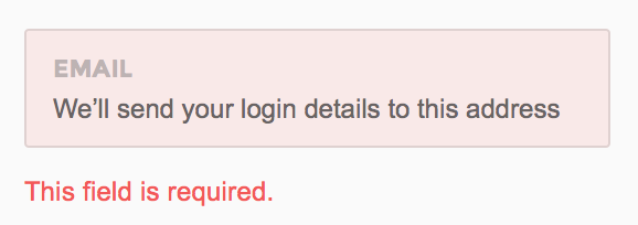
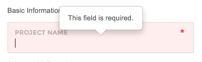
showErrors and errorPlacement functions of jQuery Validate have been overridden in Pages core. As a result, the way error messages are displayed will differ depending on the form layout style you've declared in the code
Standard
Standard way of showing error messages. Will appear on any form except for forms with attached groups
Attached
Recommended to use with Pages default form style having attached elements with .form-group-attached wrapper. The error messages will appear in the form of popovers.
Troubleshooting
This section of the page describes how to trouble shoot Javascript errors that you may in counter.
JavaScript errors are likely to prevent a web page from working as expected. By default all browsers hide the JavaScript errors from the end user.
Fortunately there are browser developer tools to inspect and debug JavaScript errors.
FAQs
Does Pages frontend have Meteor included ?
No currenly Pages frontend does not but Pages dashboard does
Does Pages frontend have AngularJS included ?
No currently Pages frontend does not but Pages dashboard does
Support
You can request for support via email or themeforest comments
We will assist you any problem you face while buidling your app via Pages framework
Themeforest Comments or support@revox.io